NPO REDESIGN
NPO REDESIGN

PAWS OF AUSTIN
PAWS (Protection of Animal Welfare Services) of Austin is a non-profit animal rescue organization that provides refuge to stray and unwanted companion animals.
Our objective was to redesign the current website to enhance the user experience by making changes to it’s Information Architecture and Brand Design to increase donations, streamline the adoption application process, and improve overall engagement.
Role:
User Experience Designer
IA Design
Tools:
Figma, Photoshop
Deliverables:
Usability Testing
Mockups/Prototypes
Brand Image & Voice Guide
Problem
How might we redesign our website to create a
more engaging and intuitive
user experience?
Redesign the current website to make it easier for visitors to navigate common tasks and find information by modernizing the visual elements, improving accessibility, and reconstructing the information architecture.
With this, we aim to increase average donation frequency, streamline the application process leading to more completed adoptions, and improve overall user engagement.
Users seeking to adopt Great Danes were faced with a low-fidelity website that lacked essential features for a smooth browsing experience. The ‘PAWS’ site is cluttered and outdated, making it hard to find information about available dogs, adoption procedures, and important resources. Users reported poor mobile responsiveness and inadequate search functionality, leading to a confusing and discouraging experience that left users less likely to complete the adoption process.
solution


current website

redesign
user journey
Exploring the Customer Journey allowed us to empathize with the customer and pain points they might encounter when trying to complete tasks.
With PAWS’s business goal in mind, we wanted to make sure users could easily reach the Donation and Adoption page. We mapped out User Flows for these tasks and identified redundant steps and unnecessary detours to optimize the process and reduce touchpoints.
ADOPTION USER FLOW

DONATION USER FLOW

heuristic evaluation
heuristic evaluation
Current PAWS Of Austin Home Page
OUR PLAN

- Comprehensive review of content
- Evaluate content quality
- Analyze user experience
- Identify Document gaps and opportunities
- Finalize Inventory
- Develop recommendations
- Use for future planning
cONTENT INVENTORY
Upon review, the original website:
Fell short in truly showcasing the organization’s values and who they ultimately serve
Lacked visual appeal with an outdated aesthetic, cluttered sections, and inconsistent margins
Contained an overwhelming amount of text and content with limited contrast to divide the sections
Had a confusing Navigation bar with too many redundant tabs and unclear titles leading to confusion
cONTENT AUDIT
During the Content Audit, we made note that PAWS could make better use of their space and negative space. Simple changes like changing the sizing of buttons and condensing the clunky paragraphs could improve the overall quality and usability of the page and its intent.
We suggested changing the typeface to be more consistent, and for colors of the page to move away from the harsh red and use a more inviting color pallet. We wanted to re-group the pages nested within the navigation so users can accomplish their goals of adoption, donation, or finding information easily without having to click through multiple pages to get there.
While the original home page only had a couple of main elements, the page still looked overwhelming and could make better use of their space.
The Navigation Bar had 7 tabs, each housing 3-7 dropdown links, which led to some confusion while finding important pages on the site.
The Donate Now button is one of the first interactions with users, which can come off as abrasive as they don't provide any backstory on why users should donate and just go straight into asking for donations. The next half off the page are sections talking about PAWS, but the text is lengthy and can push users away from reading about their important cause.
CONTENT HIERARCHY
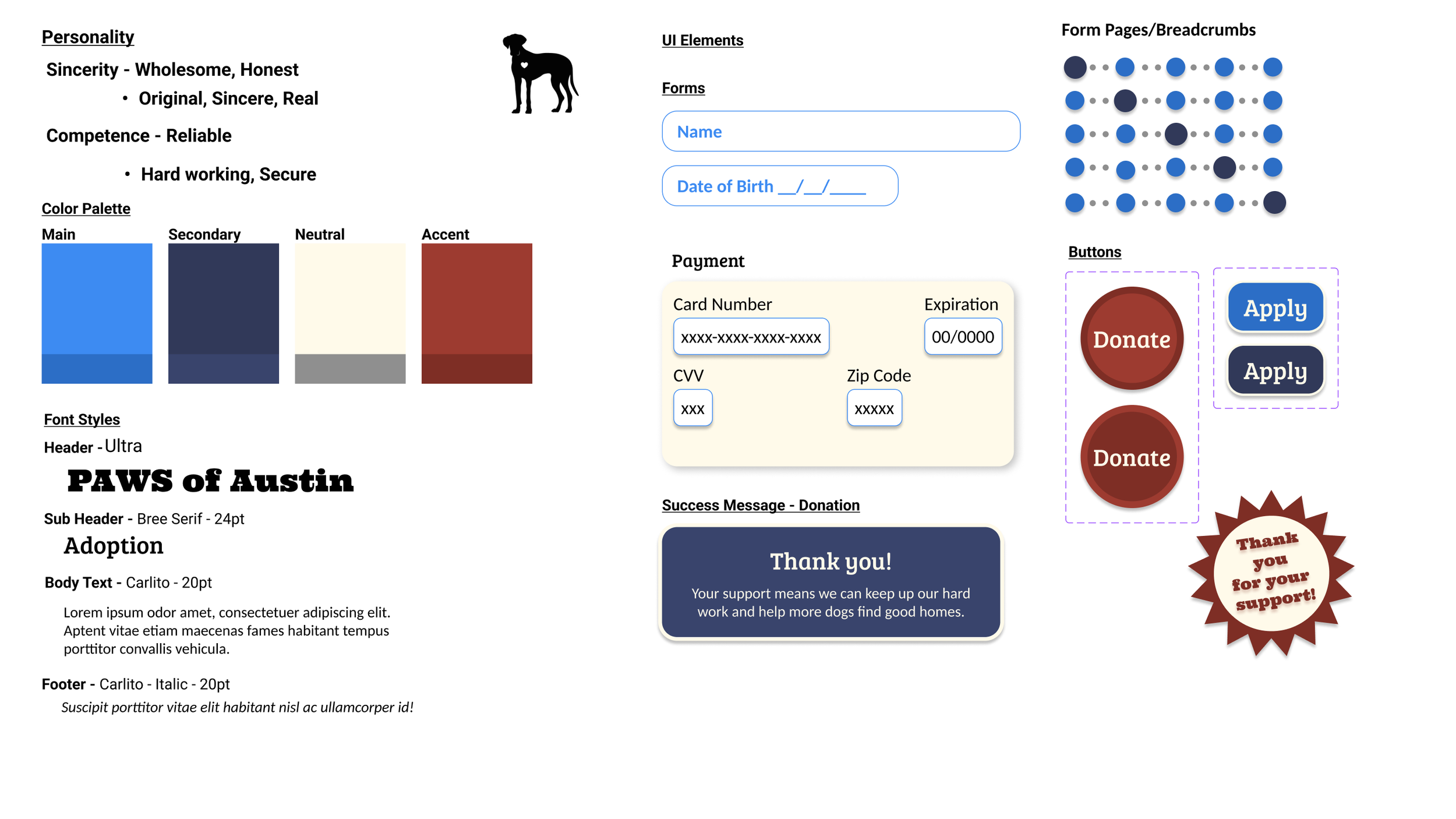
brand identity
BOLD
RUGGED
OLD-FASHIONED

Current Color Palette
RESILIENT
DEPENDABLE
HARD-WORKING

Redesigned Color Palette
When updating the PAWS visual identity, we wanted to keep the same color scheme they did, using the red, white, and blue palette they currently use to represent Texas, but give a more modern yet rustic feel. The font styles we chose were more playful and had more character, but still maintained a consistent, professional look while allowing users to see how text was organized upon first glance.